My Selecton

You have not added a product to your selection yet.
CLOSE

Finding your prefect accent colour

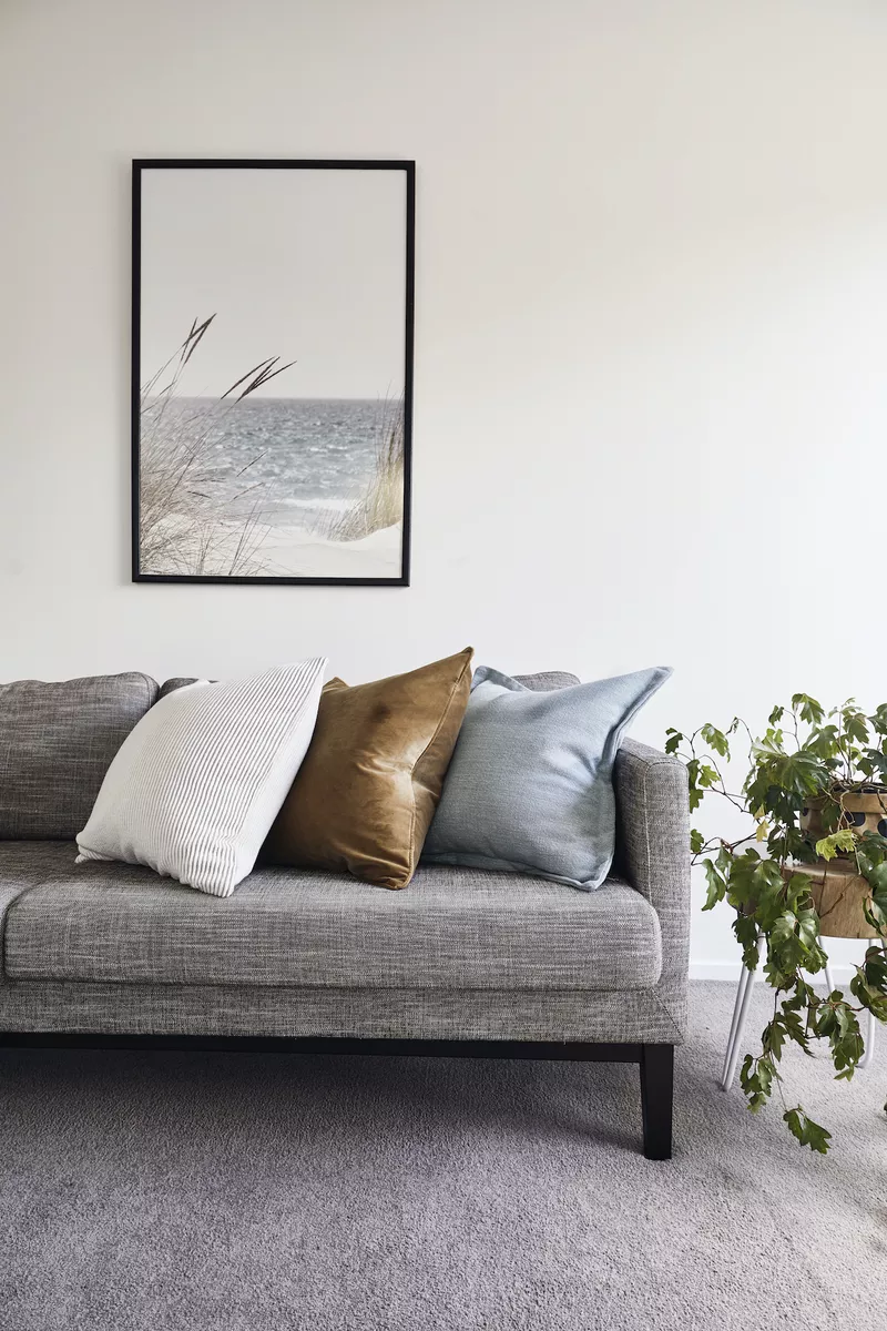
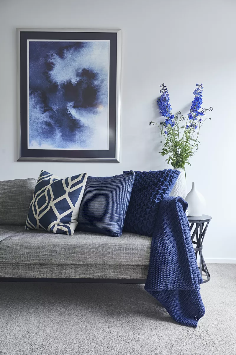
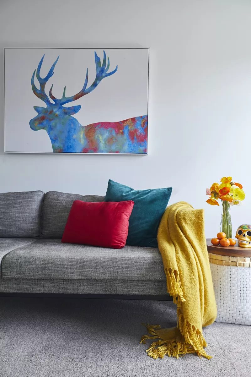
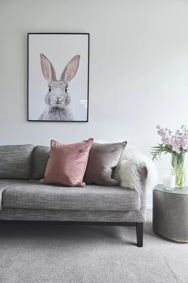
Let's talk about accent colours – they're basically the secret sauce of interior design. Think of your room as a really good outfit: you've got your basics covered, but it's that pop of colour in your scarf, shoes, or jewelery that makes people go "wow!"

The beauty of accent colours is they do all the heavy lifting without needing a total room overhaul. Nervous about commitment? Start small with throw pillows, a chunky knit blanket, or even a vase of fresh flowers. These are your no-risk options that you can swap out whenever the mood strikes. Feeling bolder? Go big with a jewel-toned velvet sofa, a feature wall, or some eye-catching artwork.

Here's the thing – your accent colour should feel like you. Whether you're drawn to moody, dramatic hues or soft, barely-there pastels, there's a whole world of options. Lets walk you through some popular directions and how to make them work in real life.

​Earth tones

If you love the feeling of a cozy autumn afternoon, earthy accents are calling your name. We're talking rich terracottas, warm ochres, clay browns, and those gorgeous golden tones that feel like sunshine on your face.

Pro tips:

  • Layer in copper or brass accessories – they catch the light beautifully and add warmth
  • Mix matte and glossy finishes in the same colour family for depth
  • Try a burnt orange throw on a cream sofa, or terracotta pots clustered on a shelf
  • Don't forget texture: think woven baskets, leather, and raw wood

Moody blue

Here's why blue is the most popular choice in interior design: it's incredibly versatile and hard to mess up. From deep navy to soft powder blue, it works in literally every room and pairs with almost anything.

Pro tips:

  • Go tone-on-tone with different textures – a velvet navy cushion next to linen curtains in the same shade creates serious visual interest
  • Navy works beautifully as a neutral and pairs unexpectedly well with warm tones like coral or mustard
  • Use blue in rooms where you want to feel calm – it's scientifically proven to lower blood pressure
  • Mix in some white or cream to keep darker blues from feeling heavy

Bright and bold

If your personality is more "confetti cannon" than "quiet library," embrace it! Primary colours – think sunshine yellow, fire engine red, cobalt blue – bring instant energy and personality.

Pro tips:

  • Use the 60-30-10 rule: 60% neutral, 30% secondary colour, 10% bold accent
  • These colours work best in spaces where you want energy – kitchen, home office, playroom, or entryway
  • Balance bold colours with plenty of white or neutral space so your eyes have somewhere to rest
  • One statement piece (like a red accent chair) often works better than lots of small bright items scattered around

Pastels

Pastel accents are like a gentle exhale – they add colour without shouting about it. Blush pink, mint green, lavender, pale peach – these shades keep things light and airy while still being more interesting than plain neutrals.

Pro tips:

  • Pastels love contrast – pair them with darker furniture or metallic accents to avoid looking washed out
  • Mix warm and cool pastels (like blush with sage green) for a sophisticated look
  • These work beautifully in bedrooms, nurseries, and bathrooms where you want a calming vibe
  • Add texture through velvet, faux fur, or silk to make pastels feel luxe rather than flat

Natural & neutral

Can't decide on a colour? Let nature do the work. This approach is all about bringing the outdoors in through plants, natural wood tones, stone, and subtle metallics like gold or bronze.

Pro tips:

  • Living plants are accent pieces that literally grow with you – try a statement fiddle leaf fig or trailing pothos
  • Mix different shades of green through plants, artwork, or textiles
  • Gold accents (picture frames, cabinet hardware, light fixtures) add warmth without competing with your greenery
  • This scheme is perfect if you're renting or like to change your mind – it's super flexible
  • Consider texture: rattan, jute, linen, and raw wood all add visual interest in neutral tones

Still not sure where to begin? Here's my advice: look at your wardrobe. What colours do you gravitate toward when getting dressed? Chances are, those same shades will make you happy in your home. Grab some paint swatches, order a few inexpensive accessories in different colours, and see what makes your heart sing when you walk in the room.

Remember – there are no design police. Your home should make you happy, not follow some rulebook. So whether that means hot pink pillows or a collection of succulents, go for what brings you joy.

For more interior inspiration, check out Harrisons stunning range for carpet, laminate, vinyl flooring options, curtains and blinds.

Now let us measure your home and give you a price on the spot

Book now for a SAFE in-home measure and quote to lock in the specials.